
It’s easy to invent stuff. The tricky part is coming up with things that haven’t already been invented by someone else.
I accepted this reality a long time ago. It therefore didn’t faze me to learn that my latest invention – the shuffle diagram – is old hat.
Not only are shuffle diagrams already all over the Internet, they even live there under the very name I gave them without having ever seen or heard of one!
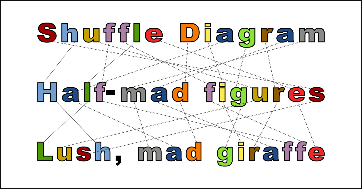
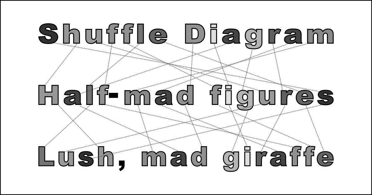
A shuffle diagram pictures two or more rows of objects. Each row contains the same objects, but in differing arrangements. Each item in the row above connects by a line to its counterpart in the row below, showing how they shuffle around to produce the new sequence. Matching items typically appear in matching colors.
For example, you can rearrange the letters in “shuffle diagram” to spell “half-mad figures” or “lush, mad giraffe” (and probably lots more). You also can illustrate and dramatize this respelling – this anagram – with a shuffle diagram:
 Shuffle diagrams are useful for many more things than anagrams. In fact, in scouring the web, anagrams are one usage I so far haven’t seen at all. Yet they strike me as a perfect pairing. Here’s the scoop:
You know I love anagrams. especially those I discover myself. An anagram is an expression you spell by rearranging the letters of some other expression – preferably in such a way that both expressions are related. Anagrams typically are funny, satirical, or surprising – or some combination.
Anagrams are fine even if all we do is write them out. But they’re more fun if we can display their letter rearrangement in some eye-catching fashion.
One great way to do this is with a video anagram: Show the actual letters of each phrase sliding around to form the other. I’ve created such visuals, for example, here and here. (Technically, these are not video files, but GIF animations. The point is, they move!)
Video is great if you post these images only on web pages or social media. But what if – like me – you intend someday to collect your anagrams into a book? Animations don’t work on the printed page, or even in electronic books such as Kindle. Maybe someday ebook formats will accept them, and I’ve read about “electronic paper” — but neither is here today.
That’s why I’ve been pondering static formats to show off the alphabetic reshuffling of which an anagram consists. And that’s when I came up with the idea of a shuffle diagram. (And even called it that, as I said, before learning that that’s what it is called.)
My first shuffle diagram featured the anagram with which I celebrated our planet’s latest journey around the sun: “Happy New Year to all” rearranges to spell “really open pathway”.
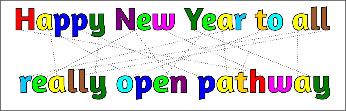
In addition to connecting lines, I’ve linked corresponding letters by color coding. Thus every “h” is red; every “a” is yellow; etc. This is a common feature of shuffle diagrams, although sometimes the same effect is achieved by mere shading, and sometimes isn’t needed.
It’s easy to superimpose a shuffle diagram onto a photo:
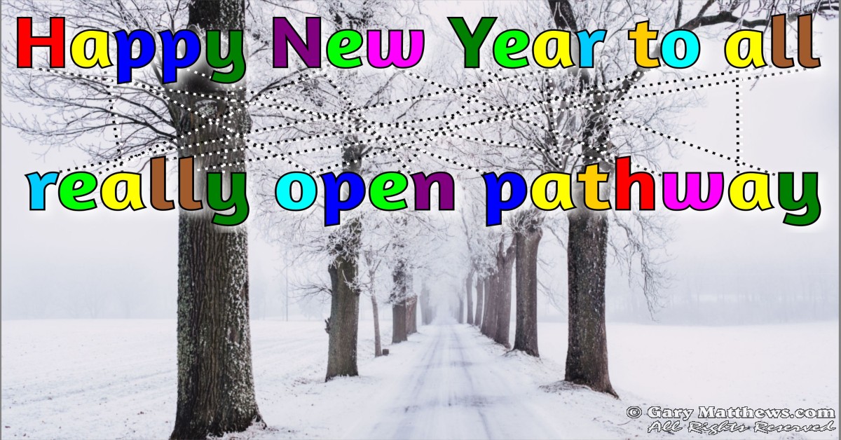
To make this work, I added a reverse drop-shadow and played with the contrast of the connecting dotted lines. This is easy with most any photo and any anagram.
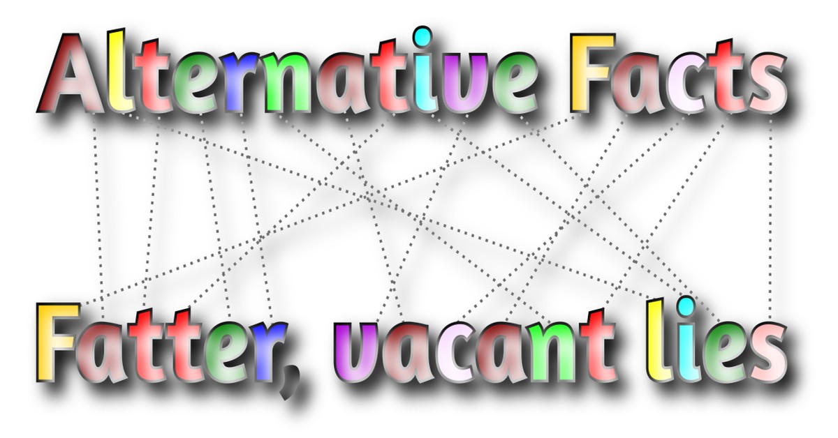
One can play endlessly with fonts and special effects. Recently I posted anagrams of the expression “alternative facts”, which I could have exemplified with this graphic:
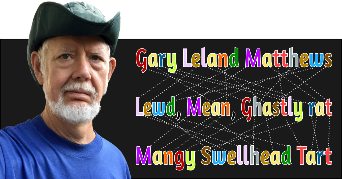
Shuffle diagrams seem to work just as well on dark backgrounds as on light ones. For example, I’ve noted before that the letters in “Gary Leland Matthews” rearrange to spell a boatload of unflattering things like “lewd, mean, ghastly rat” and “mangy swellhead tart”:
Did I mention books? In principle, ebooks can display color, and many do when viewed on a smartphone or general-purpose tablet. However, a high proportion of ebook readers such as the Kindle Paperwhite display books in grayscale, even if they are formatted for color. It’s therefore important to note that shuffle diagrams look just fine using monochrome shading.
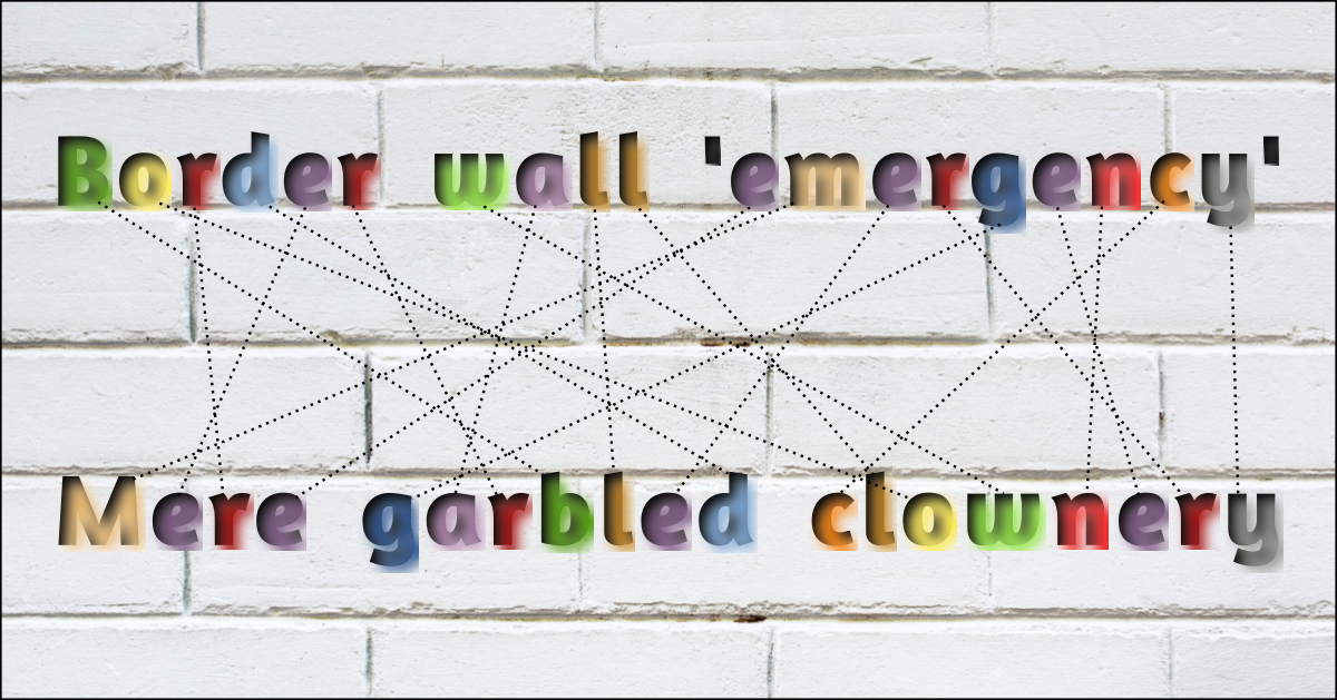
Given the right context, shuffle-diagrammed anagrams are a great way to comment on current events. I’m herewith revealing (for example) that the letters in “Border wall ‘emergency’” slide around to spell “Mere garbled clownery”:
Enough examples! At this point, I’d like to stop and ask for viewer feedback: Do these shuffle diagrams work as intended? By “work” I mean, do they make it clear that the associated phrases are, in fact, rearranged versions of one another? Do the color-coded letters and connecting lines make it easy to see how and where the letters move? Do you see problems – or improvements?
Perhaps most important — can you think of a better way (not counting video) to show off an anagram?
Please leave your thoughts in the comments section, or drop me a private note. And thanks in advance!
(This article is part of my series on words that are #worth1000pictures.)
7 responses to “Two Words: Shuffle Diagram”
Good ones!
Gary, enjoyable as always. I especially liked the anagrams of your name!
Terry, have you checked out the many other anagrams of my name? If not, you’ll enjoy reading “The Gary Matthews Anagrams” at https://garymatthews.com/2015/12/gary-matthews-anagrams/.
Be that as it may, the letters in “Terry Edwards” rearrange to spell (among many other things) “terser, wry dad” and “drew dry tears”. We both enjoy the anagrammatic advantage of having names with a good balance of vowels and consonants, plus an absence of hard-to-place letters like q, x, or z.
Very funny and enjoyable read, Gary. I would have never guessed that shuffle diagram is an actual term already in use! But this means that your original thought is on the right track and you will invent something that no one has. I am paraphrasing Feynman here. In one of his books/lectures/lectures-made-into-books he mentions that one day he was super excited he discovered something. However, upon further research he found it was discovered couple hundred years prior. Next time he stumbled upon something he found out that that was discovered less than a hundred years before he did. And then the next time it was only a few decades. Then it was a few years. All the time he was catching up what had been discovered over hundreds of years. Finally, he discovered something that was discovered that same day. By him. And he won the Nobel for that.
Terrific story about Richard Feynman, Dev. Never will I be in his league, but it’s good encouragement.
One point I didn’t stress, but perhaps should have: Being the first to figure something out isn’t that important. What’s important is the figuring. Many a young math student discovers some exciting theorem, only to learn from her teacher that Euclid or Pythagoras codified that same proof thousands of years earlier. However, that teacher should add (and many do): “You found it for yourself, without knowing about this earlier instance. So yours is just as much a reason to celebrate.”
Nevertheless, there’s undeniable satisfaction in being the first (however rare those occasions may be). One reason I love anagrams is that anyone who generates enough of them inevitably will come up with at least some that no one else ever thought of before. As in, who would be crazy enough to try to make anagrams of the phrase “shuffle diagram”? And why?
Speaking of which: You’re an engineer, poet, and photographer, skilled in conveying ideas with visual art. So I’d particularly value your opinion on whether shuffle diagrams constitute a good way to showcase anagrams?
I’m curious, for example, about how well the connecting lines work for you. Taken all together, do they make clear, at a glance, that each successive phrase consists of the same letters as the first, reshuffled? Or do the lines perhaps form such a jumble that they look like a tangled web — so that the viewer is more likely to wonder why they are there? Or even overlook them?
What I need here is honest criticism. It’s possible I’ve been fiddling with, and staring at, shuffle diagrams for so long that I’ve lost my objectivity. Maybe my own foreknowledge of their purpose (in my anagrams) is blinding me to their limitations. What do you think? Are they more apt to confuse, or to clarify?
Thank you for your confidence in me, Gary! Not sure this is the right field of application of my skills (I think what you are asking falls in the purview of “Design”) but I’ll give it a shot.
My honest opinion is that the lines do not initially make sense, at least they didn’t to me. After reading your essay, I understood what you were trying to do, but the diagram wasn’t obvious at first glance. Or, put it this way, you kind of get the idea, but the letters dominate and the lines almost fade into the background, thus losing their meaning. One way to mitigate that might be to put little arrow-heads on the lines themselves to show that a letter from the first line had traveled to a different position in the second line. They don’t have to be in-your-face. Just a hint might work. These arrows can be static, but then they have to be arranged in a pattern so they don’t look cluttered. They can also be dynamic, but that would require a gif, instead of a plain jpg. It can be little arrowheads moving from the first top letter to the bottom letter and fading; then the sequence repeats for the second letter and down the line. There are probably a million ways to do this. But some hint would help.
Also, any background image makes it worse. And the longer the phrase is the greater the vertical distance should be, I think. Otherwise, there are too many lines crisscrossing a very short space.
Now the multilevel diagrams are more complicated. There the lines are dominated by the letters.
Sorry I couldn’t come up with any fancy suggestions. Feel free to dismiss any or all of them if you don’t think it doesn’t make much difference. 🙂
On reflection, Dev, I think you are right. Good try or no, shuffle diagrams aren’t particularly effective in sharing the underlying logic of an anagram.
Full disclosure: I worried that you weren’t the best person to ask. But not because I consider you less qualified. It’s because I figured you’d be more likely than the average viewer to see at a glance what was going on. More likely than I’d be, if the tables were turned. So if you don’t find it “obvious at first glance”, then surely a lot of other folks won’t, either.
Length is also, as you suggest, a potential problem. For short anagrams like silent=listen, a shuffle diagram might work. But with even medium-length ones, the criss-crossing lines become a cobwebby snarl in the center. Most of my own best anagrams are of medium length, but sometimes there are longer ones. If memory serves, my longest to date was 116 characters.
And for any solution that requires an animated image, the question becomes: Why not simply show the actual letters transposing? Then the viewer doesn’t need to intuit what is happening; it just happens!
But of course, that doesn’t solve the conundrum of how best to represent anagrams as images printed on paper. We don’t yet live in Hogwarts (although, at the rate of tech progress, I can’t rule out electronic paper!) So for now, it’s back — literally — to the drawing board.